
Vello CRM
Visual identity and sales page for an AI-powered management system for car and motorcycle dealerships.
- My role
- Brand briefing, visual identity and sales page structure
- Client
- Vello CRM
- Timeline
- Sep. 2026
- Status
- In progress
Context
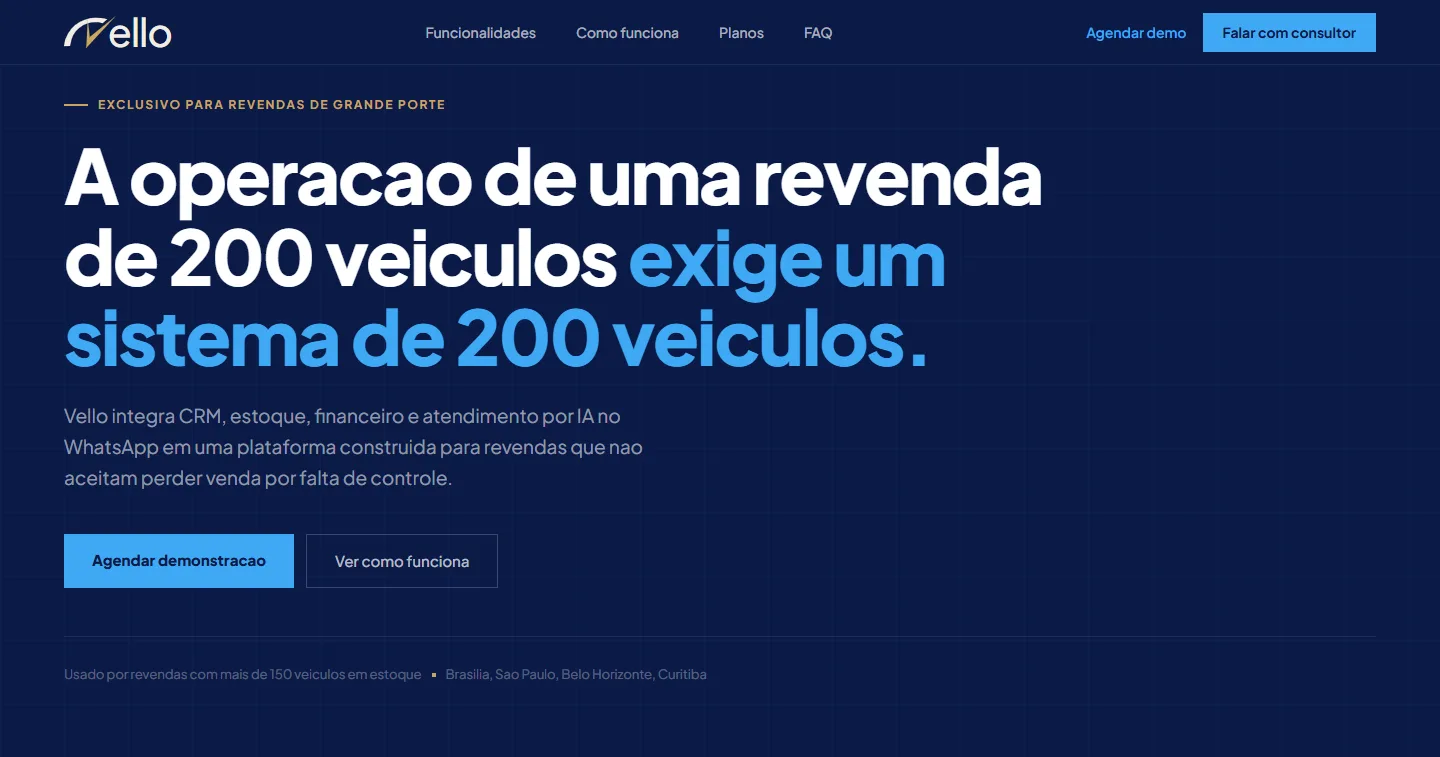
Vello CRM is an AI-powered management system for car and motorcycle dealerships. It brings CRM, inventory, finance and AI customer service on WhatsApp into one platform.
The product is built for large dealerships with more than 150 vehicles in stock. Over the last 12 months, more than 4,200 vehicles were sold through it.
The project covered the brand's visual identity and the product's sales page.
Problem
The challenge was to position a B2B software product as a serious, exclusive brand that earns trust, moving away from the "friendly" look common in management tools.
The sales page had to win over owners and managers of large dealerships, who already use some system and only switch when they see what staying put is costing them.
My role
- Ran the brand briefing with the client to define positioning, audience and tone.
- Created a new, more sober and commanding visual identity.
- Structured the sales page: information hierarchy, selling points and calls to action.
Process
After the briefing, I set the positioning: Vello doesn't speak to every dealership, it speaks to large operations. That focus shows up in the page headline and guides the rest of the work.
For the identity, I used navy blue as the base, a light blue for highlights and a subtle gold on section labels. On the page, I ordered the blocks so the product is shown working before the feature list.
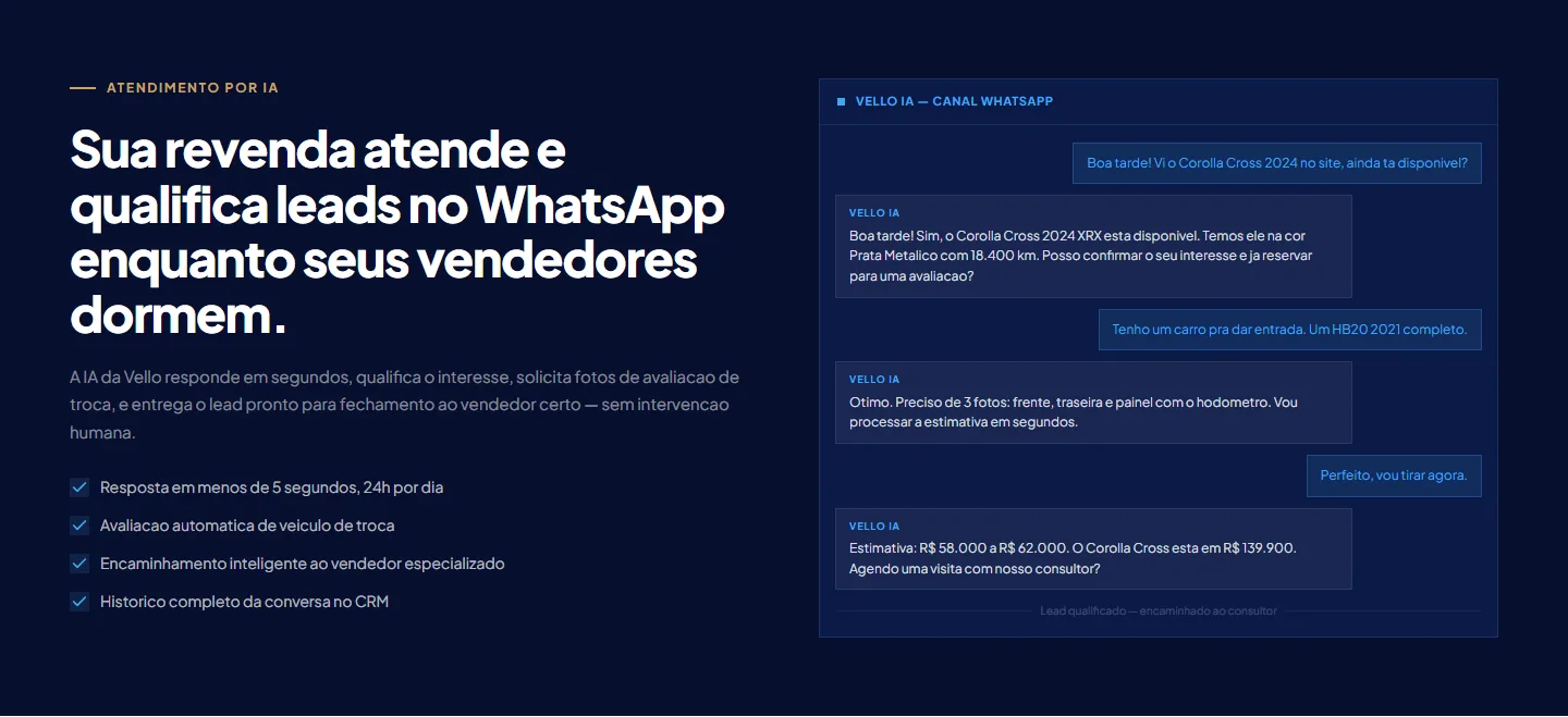
The AI at work early on the page: a real service chat, from the customer's question to the trade-in estimate. 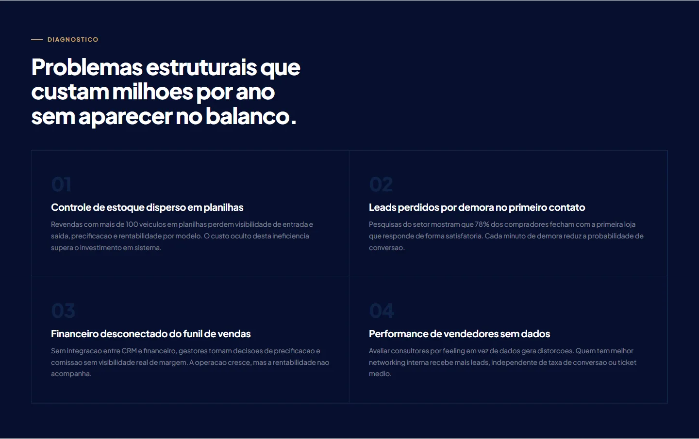
Diagnosis: the four pains of a large dealership, each with the cost it creates. 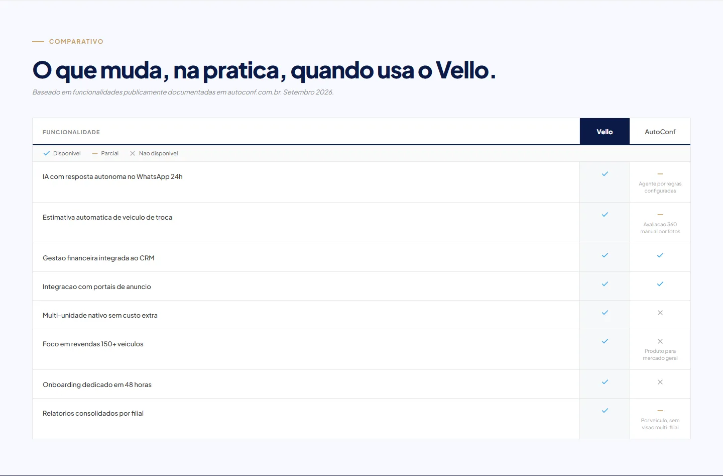
Comparison with the main competitor, based on publicly documented features. 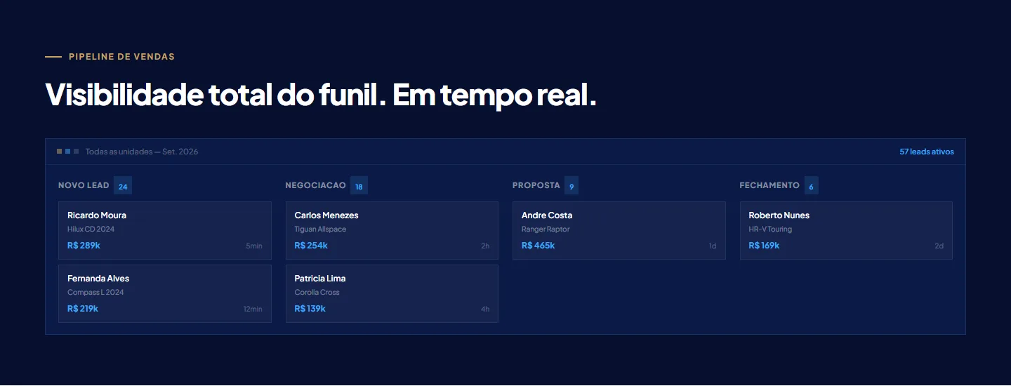
Sales pipeline: the dealership's whole funnel on one screen. 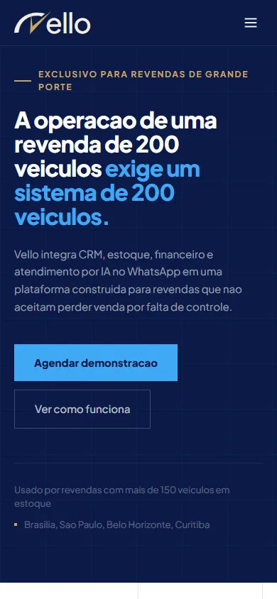
Mobile version of the top of the page.
Key decisions
Removing rounded corners
WhySquare corners make the interface more sober and move the brand away from the "friendly" look common in management tools, which is exactly what the positioning wanted to avoid.
A sales page built on information hierarchy
WhyThe page opens with who it's for and the product's numbers, shows the AI answering on WhatsApp, and only then lists the features. Next come the dealership's pains, the three-step rollout and the competitor comparison. By the end, visitors have seen the product working and the cost of not switching, and the call to book a demo appears both at the top and at the close.
Showing the system instead of describing it
WhyFor a manager who already uses another system, a feature list doesn't set anything apart. The WhatsApp chat and the pipeline with real deals show what day-to-day work with Vello looks like before any promise is made.
Outcome
The sales page is live with the new identity. It brings together Vello's proposition, the product in use, the operation's numbers and the competitor comparison.
Status: In progress.